
Custom Design System & Component Library Development in NYC
Reusable, accessible, and themeable React component libraries that maintain brand consistency across all touchpoints.
What this service is.
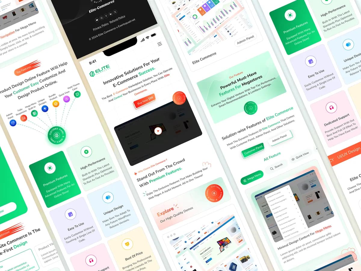
We design and build tokenized component libraries — typography, color, spacing, and elevation all documented and reusable — so your product stays visually consistent as your team and codebase grow.
One system across every New York product surface
New York teams often ship across a marketing site, a product, an internal tool and a mobile app, sometimes with several agencies involved. A shared design system keeps those surfaces consistent and stops your designers and developers from rebuilding the same button. We deliver the Figma library, the coded components and the documentation together, so the system survives staff changes.
- Figma tokens synced to Tailwind so design and code never drift apart
- Accessible components (WAI-ARIA, keyboard support, contrast) built in
- Documentation your in-house team can maintain without us
Why it moves the needle.
What's included.
Transparent pricing.
Includes full component documentation
Frequently asked questions.
Everything you need to know about our Custom design systems & component specs services.
Let's Build Something Extraordinary.
Tell us what you're building. We'll respond within one business day with a fixed-price scope, not a sales call.
Book Your Strategy Call